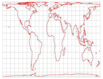
Real map of the world
The image of the world was formed by the Mercator projection. When people think about the physical size of countries and continents, they usually think this is the reality:
http://oem.sherwin-williams.com/images/maps/world-map.jpg
But it isn't. The countries of the north are smaller than shown and the southern are bigger. How could that be?
Well, the Peters projection changes that small problem, and the result is surprising. The real Earth is something like this, where the relative sizes of countries and regions are preserved.


Notice than South America is now not smaller than North America! Notice the percentage of Eurasia that represents Africa. And notice how big is Australia in comparison to Western Europe. And notice that suddenly Greenland and Scandinavia shrunk!
Amazing, isn't?
Now, if we see that Map in the Austrialian style, the result is even more surprising. Ladies and Gentlemen, this is your planet.
Keine Kommentare:
Kommentar veröffentlichen